Fred again...

I just came across the NPR Tiny Desk Concert with Fred again…, and wow it did not disappoint. I had limited prior knowledge of Fred again…, but I got swept in with a little clip of the acoustic performance. He’s a really talented producer for numerous pop artists, and he primarily writes his own electronic music. So, this acoustic, intimate setting was a change of pace from his usual performances.

And, it’s beautiful. It’s raw. It’s personal. What I especially love about it is the way he layers different tracks in real time, right before your eyes. He starts with a simple looped vocal, then adds some piano, then a little marimba, and finally throws in a set of beats. This layering creates a wonderful sound, and eventually, he reverses and starts stripping those layers away again.

After I left my trance of 26 minutes and 44 seconds, I began to consider how layering is such an important element in all types of art. For paintings, artists notoriously paint and repaint on top of their canvases. For fashion, designers continually play with the layering of different textiles. And for architecture, (you didn’t think I wouldn’t talk about architecture did you?) architects layer materials and systems. Let’s look a little closer at that.

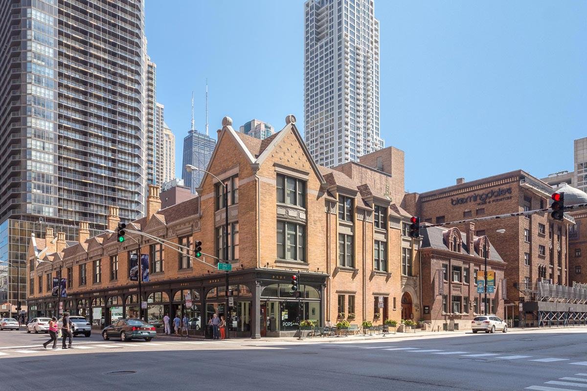
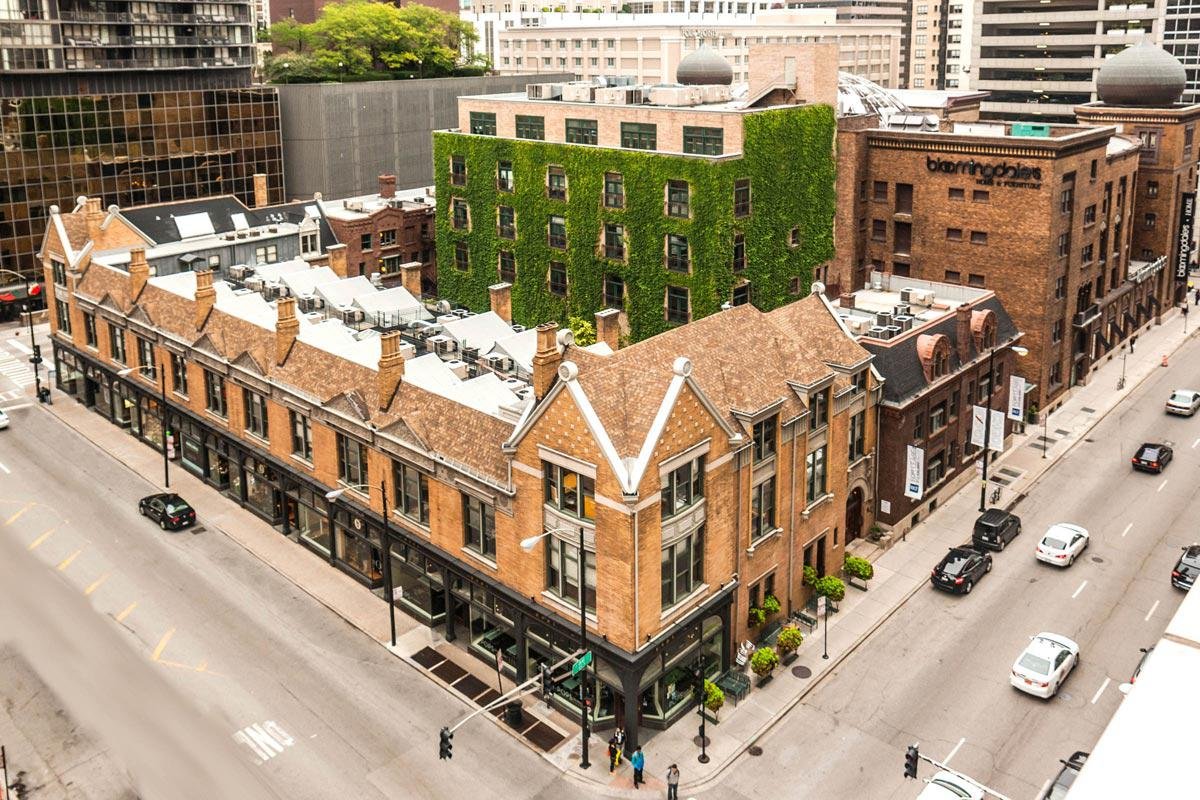
Tile backsplash meets marble countertop, window glass meets aluminum frame, hardwood flooring over plywood sheathing meets hardwood baseboard, hardwood window trim meets painted drywall, framing meets concrete foundation, Materials are constantly layered within architecture. The overlap is seemingly less than the musical tracks of Fred again…, but the resulting collage remains the same.

Architects start with a conceptual idea, which then gets layered with more and more information throughout the design process. Quite literally you can layer pieces of trace paper while drawing. (That directly translates to the layer management of the digital model.)

In construction, mechanical systems are intertwined with structural, framing systems. Gypsum board covers the framing. The entire building gets wrapped in layers of sheathing, exterior insulation, and cladding. Trim goes over the gypsum board. I’m not going to describe an entire building, but you get the point. Building and designing is a layering of ideas and systems, and it’s fun to see it in a different context.


Barnes Foundation

What do drugs and art have in common? No, I’m not talking about artists doing drugs. Nope, also not talking about art about drugs. I’m talking about a remarkable collection in Center City, Philadelphia. Eh, I still feel like you’re getting the wrong idea. Please hold.

Dr. Albert Barnes was a very successful medical practitioner who made his fortune with the invention of the drug Argoryl in the early 1900’s. He also was an avid collector of Impressionist, Post-Impressionist, and Modern paintings. In the 1920’s, he hired Paul Cret to design a private museum for his collection in Merion, PA (distant suburbs of Philadelphia), and in his will, he said that the artwork as well as the layout should not be altered what so ever. Barnes was really weird about allowing access to the museum; for most of his life, he only invited friends and didn’t allow the public to visit. He also was really particular in how he displayed his artwork - not leaving much space in between paintings that he juxtaposed together for color, composition, and subject (as opposed to grouping paintings based on style or era).

Image Courtesy of Barnes Foundation via ArchDaily

But roughly 50 years after his death, his will was essentially broken to move the entire collection into downtown Philly to improve the foundation’s finances and to provide better access to the general public. There was a huge controversy over the legal battles. I mean, you could make a movie about it. No, seriously, there’s an entire documentary about it (though I haven’t actually watched it yet so I can’t necessarily recommend it or not). As Paul Goldberger explains in his review for Vanity Fair, the history is a little confusing and convoluted, but it’s really helpful to better understand the building.

Speaking of, as you stroll down the Benjamin Franklin parkway in downtown Philly, you notice a few different buildings. The Philadelphia Art Museum looms in the distant, marking the end of the parkway. (I was planning on writing an entire review of the new Frank Gehry renovation here, but it was pretty understated and so un-Gehry-like, I am passing on that). But, there are two buildings on the parkway that feel quite comfortable in their spacious sites - the Rodin Museum and the Barnes Foundation. The Rodin Museum is pretty and well done, but, no offense, that’s not why we’re here.

Image Courtesy of Barnes Foundation via ArchDaily

The Tod Williams and Billie Tsien-designed Barnes has a striking, modern presence, configured with a heavy, large format stone-clad rectangular box nestled in the Laurie Olin-designed garden and a floating glass box above, cantilevering to create a a covered ground floor outdoor terrace. I’m not really sure why I’m describing this to you since you can just look at the picture, but it’s fun to try to place the entire exterior essence of the building in one brief introductory sentence.

And the exterior is really important. It’s a nod to what’s inside. The stone has a monumental feeling - alluding to the power of the art inside. And the Mondrian-like collage of the stone is reminiscent of the layout of the paintings on the wall - different sizes and proportions of rectangles juxtaposed together that create a quasi-grid.

Walking past the ticket booth and through the sand-blasted concrete walled entrance, you approach the building through a zen-like tree-lined path, which is separated from the building by a 10’ wide minimal depth pond.

The entrance is intimate, and it feels like you have walked into someone’s personal library. The wood-paneled interior and the 15’ plus ceiling height gives it an approachable importance. After entering, you are guided past a staircase into the Light Court. First impression is that it’s just a bit too big. Why do you need that much space? There’s a small coffee bar at the far end and a ton of lounge seating - open to all. But at second glance, there’s a feeling of being outside again. That’s why it feels big. The clerestory windows* are the sky, and the same cladding that was used on the exterior is now on the interior. It’s like the city’s outdoor living room, where they can host events and receptions year round. There’s outdoorsy expanse and openness, but it’s protected with hardscape.

*basically windows above head height, but in this case I’m talking about the light coming from the white ceiling

The Light Court

Image Courtesy of Barnes Foundation via ArchDaily

The permanent collection is on the opposite side of the Light Court and it’s an obvious transition. Experientially, it’s totally separate from the Light Court, and you can really feel that you are crossing a threshold. On the first go around, it feels like a French chateau was scaled down by 50%. All of the viewing rooms are connected with thick doorways, no hallways, and there is art everywhere. Honestly a bit overwhelming. But, after attending a short presentation about Dr. Barnes and his vision of the collection, everything makes more sense. Now, the second journey through the spaces is on another level (speaking figuratively, though there are physically two levels to the collection). The abstraction of details from the original building in Merion are wonderful Easter eggs to find, and the addition of the indirect lighting from above elevates the art.

Typical layout of the artwork

Image Courtesy of Barnes Foundation via ArchDaily

Within the permanent collection, you pass a light well, overlooking a small outdoor patio on the lower level. It’s a wonderful connection between the stories, and it’s such a subtle way to urge you to explore more of the building. So, guess what. I did. And the lower level does not disappoint. It’s used more for the educational portion of the foundation, along with the museum shop, and some of the support services like bathrooms, storage lockers, and an extension of the kitchen from the restaurant on the ground floor. But walking into the small outdoor gardened light well was surreal. Two lounge chairs beg you to sit. The three trees perched in the garden extend towards the sky, leading your eyes up as the light dances across the textured stone exterior. You forget where you are for a moment. You forget who you are for a moment.

At this point, you’re probably like, okay Curt, we get it…you like the museum. And you’re right, but, actually, I’ll go far as to say that I absolutely love this building. It reveals itself over and over. It acknowledges its deep history without replicating it. It celebrates a unique way of viewing art. And, in turn, it becomes art. It becomes part of the collection and a part of the city, and it’s a must see for any art and/or architecture-loving tourist or Philly local alike.

ICON's House Zero

New materials and products seem to always be coming onto the scene in the construction industry. High performance windows, eco-friendly finishes, recycled plastic furniture - even entire pre-fabricated homes are now available off the assembly line! But, new technology and processes are harder to come by - mostly due to the fact that it’s really difficult to convince a builder to try out a new way of doing things (annoyingly understandable because it costs time and money to learn and train people about something new).

And that’s why it was so exciting to check out ICON’s House Zero in Austin, TX this weekend. Designed by Lake Flato Architects, House Zero is a 3D printed house - built to showcase ICON’s concrete 3D printing capabilities. It’s a beautiful home. Nestled in the hot market of East Austin, it’s a cluster of concrete organic, curvy “tree trunks” creating the exterior wall, with glulam beams spanning the width of the house and creating a clean, flat roofline.

Street view of House Zero

Image Courtesy of Casey Dunn via ICON

The floor-to-ceiling windows and doors create an accessible feel to the building, and the limited material palette allow the building and its interior design to shine. The layers of the 3D printed walls create a texture that can catch the light just right. ICON’s technology is really similar to small format desktop 3D printing, but if you’re unfamiliar with that, let me attempt to explain. (Or you can just watch a video from ICON.)

So, there is a nozzle attached to a gantry (laymen’s terms: moving arm.) That nozzle slowly releases the building material (normally plastic in small scale and concrete in the case of ICON). As the nozzle is extruding material, the arm moves around according to a programmed file. 3D printing is pretty sweet. It can make some serious shapes and can lead to some amazing accuracy. And, it’s ‘mostly’ a set-it-and-forget-it situation, which gives you time back in your oh-so-important day.

ICON’s Vulcan nozzle extruding concrete

Image courtesy of ICON

Matt Risinger’s video is a great tour of House Zero with ICON’s co-founder and CEO Jason Ballard. They get into some of the nerdier details, so I urge you to check it out (the video is ~18 min long) if you’ve made it this far. As with most new technology, it’s pretty expensive to use right now, but there is a lot of opportunity here. Specifically, the cost of different wall thicknesses does not change that much because the nozzle just needs to go a little farther. As opposed to a stick-built house, where you need a completely a new stud size or maybe even double the studs to change the thickness of a wall.

Main Living Room of House Zero

Image Courtesy of Casey Dunn via ICON

Though concrete has recently taken a beating as a not so eco-friendly material, the fact that the structure can be the finish both inside and outside leads to an admirable honesty of the building. The efficiency of the technology is exciting, too. Another one of Risinger’s video visits a different ICON project, where smaller homes are printed in a week (pretty sure that includes just the first floor and none of the windows or trim or anything like that, but still, dang that’s quick). Less time should equal lower cost, right? So hopefully that means this isn’t just for the rich.

But, I also want to know what the average builder thinks about this. The general consensus on robots and automated technology is that everybody is going to lose their job and we are all going to end up like the fat people in WALL-E. Though I studied economics in undergrad, I am severely under qualified to evaluate that assessment of our future. So, naturally I’ll attempt to anyways.

I have faith that new jobs will emerge. They won’t look very similar to what we’re doing now, but we, as humans, will always create value in this world, not just consume it. The future is bright in my eyes. New jobs and new houses - hopefully 3D printed (maybe with recycled materials?!). That’d be ICONic.

Four Walls and A Roof

The Complex Nature of a Simple Profession

it’s quite a title, right? And with an engaging and thoughtful opinion piece published on Dezeen, it’s exciting that there’s an entire book!. But, in short, this book is good. Not great. Just good. Let me explain.

Reinier de Graaf’s state of mind in the preface is refreshing: “Why this book? Most architects are lousy theorists: I am no exception. Whenever we offer theories, they should be mistrusted,” and then he notes, “That doesn’t mean, however, that what architects have to say is without value,” (xi).

I appreciate his self-awareness. Even though it doesn’t necessarily come across in the book, it’s a nice gesture. If anything, it’s a great jumping off point. It’s meant to ground him. He and the reader are equals. (It has taken all my willpower to not make a sarcastic comment about architects thinking they are equals with others. You’re welcome.)

Image Courtesy of Harvard University Press

The book is a collection of 44 different essays from de Graaf - about half written for the book and the other half written for other occasions. And, the topics are wide ranging.

There are well-researched history lessons - profiles of communism-led urban developments, origin stories of building technologies, and specific case studies, in particular the Hartsfield-Jackson International Atlanta Airport (I’ve said this before, but I love airports, so woohoo!)

Broad architectural theory is sprinkled throughout the book, including one chapter titled “The Inevitable Box”: “In the name of creativity, architecture sides with the masterpiece against the cliche, with the unique against the common, with the specific against the generic. Creativity prioritizes the exception over the rule and chooses the margins over the mainstream,” (72).

A box is a traditional and fundamental way to approach architecture. (Hi, yeah it’s me, not de Graaf). It has stood the test of time, so should we continue to design boxes? Should we design an anti-box, just to be different? What is the guiding principle there? Just to be avant garde? Is that enough of a reason?

In terms of architectural theory, I thought de Graaf did an okay job. Starting from an incredibly abstract idea, he jumps around a lot (in time, scale, and everything in between). This chapter is the epitome of the book. It’s exhaustive (not quite a compliment), but it leaves you with some thought-provoking questions.

De Graaf also shares personal anecdotes from his travels and work experience, that give you a (albeit still foggy) peek behind the curtain of one of the most influential architecture firms in contemporary times. Oh, maybe I should’ve mentioned that earlier. Reinier de Graaf is a partner at Office for Metropolitan Architecture (OMA), which was founded by Rem Koolhaas. Maybe I’ll eventually do an entire post about OMA, but they’re behind iconic buildings like Seattle Public Library, CCTV, among many others, and, they’re also heavily involved in theory including masterplans like the unbuilt Parc de la Villette and books like Delirious New York and Elements of Architecture. Oh, and don’t sleep on their research arm AMO, which de Graaf leads.

Like I said, I like the book. I think it’s an interesting perspective on the current state of architecture from someone who actually has a pulse on the profession. So, I guess my issue is the actual writing. it’s often dry and unapproachable. It’s not bad, but I just think it could be better. And it being a collage of essays, it lacks a certain cohesion, yet easily hits the 486 page mark.

Demolition of Pruitt-Igoe Housing (St. Louis), which is featured in the book

Image Courtesy of Chad Freidrichs via MOMA

And, it doesn’t touch on actual architecture as much as I thought it would. Which, in general, that’s fine. It’s undeniable that the influence of architecture extends beyond its walls. For most people, that’s the point of architecture - to influence people and society beyond just the building you design. And that’s certainly what this book is trying to get at. There are many other players and decision makers, sitting right next to the architect at the table. But, my preconceived notions of de Graaf being an actual architect and the title of the book made me believe that we were going to be playing on the beaches of architecture, not jumping into the ocean of urbanism and surfing the waves of critique. Idk. Maybe, that’s my fault. But when the title of your book is literally describing a very basic house, I would think you would talk about smaller scale projects of the actual built environment. But, maybe that’s his tongue in cheek way of doing things.

In good faith, I can’t recommend this book as an “essential.” To put it bluntly, it’s overly written, and it doesn’t push the narrative enough. But still, Reinier de Graaf and this book both give me hope. There is potential in this work. De Graaf talks about the future, and there is an undeniable emphasis put on the upcoming years. However broad the questions are (there are no answers), they make you consider the future. Which is good! We need to constantly question our present. Always be looking at what is next. No, don’t get bored with what you’re doing, but question why you’re doing it. There’s always room for improvement. And, remember, the answer isn’t necessarily more complicated. it might just be as simple as four walls and a roof.

Bourdain's Love Letter

In Kitchen Confidential, Anthony Bourdain writes a love letter to the kitchen industry. It inspires to celebrate life through food. Go out to eat. Order one of everything off the menu. Have that extra cocktail. Indulge in dessert! It makes you want to cook and to taste. It’s beautiful, raw, heartfelt, and real.

I’m still waiting for architecture’s love letter. Many architects have tried their hand, but they almost all turn out to be manifestos of their own agenda. For the most part, they’re self-centered and pretty boring. But, I digress, that’s not really the point of this article, and I’m trying not to be a Debbie Downer on my occupation and passion.

Back to Tony.

As an outsider to the professional cooking world, one of the most powerful takeaways from Kitchen Confidential for me is that it makes you truly appreciate the people in the culinary industry. The grind is real; the respect is lacking. The kitchen is a hot, stressful, and chaotic mess, and, the hours are endless. Even if you are at the top - executive chef or restaurant owner, the struggle to stay financially afloat and culturally significant is a constant beating.

Image courtesy of Bourdain’s Twitter Account

Bourdain explains the mindset and approach of the people chopping your mire poix, sautéing your onions, frying your french fries, grilling your steaks, and broiling your pork roast behind the stainless steel swinging doors:

“Cooking is a craft, I like to think, and a cook is a craftsman - not an artist. There’s nothing wrong with that: the great cathedrals of Europe were built by craftsmen - though not designed by them. Practicing your craft in expert fashion is noble, honorable and satisfying,” (62-63).

Bourdain goes on to suggest that artists are essentially narcissistic people who don’t care to follow anyone’s program except their own. Most certainly not a cook.

So, that begs the question - what are we, architects?

For one, we’re not craftspeople. Generally speaking, we don’t build anything. (Yes, we might make some furniture or help with finishes, but that’s really the extent of it. And, if you do these things, that’s normally beyond the traditional scope of architectural services).

As architects, we make drawings that communicate information to craftspeople. So, where does that leave us? Are we god forsaken self-infatuated artists? Some of us are, yes. But, most of us are mere orchestrators of craftspeople.

We help guide the vision and give direction. Meaning, if we want to do our job right, we need to respect and understand craftspeople and their craft.

The About Buildings and Cities podcast has two great series on Carlos Scarpa and Andrea Palladio (some episodes of Palladio have still not been released yet). Both Italian but from completely different times in history, Scarpa and Palladio are two of the most well-respected architects. And guess what. They both understood craft!

Palladio apprenticed for a stone mason for years in Vicenza and eventually worked his way up to take on his own commissions. But eventually, he would begin a new career as an architect. Scarpa collaborated with local craftsmen throughout his whole career, and he was even the artistic director of Venini, an Italian glass making company, for many years - offering new techniques to the craft.

For Palladio, you can sense the appreciation of craft in the proportion of his projects. The use of stone adds to the monumentality and scale of the Palladian window, for instance. And Scarpa. You can sense the appreciation of craft in the materiality of his projects. The details that play with light and tactility are infused in all of his buildings.

I know that “craft” is an incredibly broad term (and, I know that I’ve said “craft” about five billion times in this blog post). But, it’s just the act of making something. And that’s the point. It’s making. It’s creating. Architecture is creating a building, and it’s important to appreciate the craft behind that creation. Perhaps a love letter to the craftspeople would do the trick.

Tree Studios

Just imagine:

Walking down the streets of River North in Chicago, you feel swallowed by a sea of metal and glass skyscrapers.  Looking down the block, you see a break in the wall.  Who is offering that view of the sky?  A low-rise brick building is the answer. It’s a thing of beauty.  It’s elegant and thoughtful.  It’s a breath of fresh air in the concrete jungle.  It’s the Tree Studios on State St.

Sounds of champagne bottles popping, haunting aroma of fresh coffee, and perfectly framed scenes of window shopping greet you on the sidewalk.  The cast iron detailing of the first floor facade is reminiscent of the Louis Sullivan-designed Carson Pirie Scott building, just a few blocks down State St.  The roman brick at the second floor provides a warm contrast to the first floor ornamentation.  Above, the chimneys reach out beyond the roof line, projecting symbols of domesticity and hearth.  The lush, green courtyard behind beacons to be celebrated. It’s a well-mannered building, unassuming in its elegance and unrelenting in its charm.

Tree Studios, Image Courtesy of Friedman Properties

Following the 1893 World’s Fair, Judge Lambert and Anne Tree hoped to entice artists (particularly European ones) back to Chicago.  They lived in a mansion at 94 Cass St (what is now Wabash Ave), and they enlisted Parfitt Brothers, an architecture firm based out of Brooklyn, NY to help them build a community in their backyard.

The English Queen Anne main building, running along State St, was built in 1894.  By 1912 and 1913, the English Arts & Crafts annexes (the additional buildings to the north and south) were finished, creating a U-shaped courtyard in the back. (My understanding is that the mansion was on the east portion of the block, but has since been replaced by the Medinah Temple.) Also, the comical irony of a Chicago-based couple attempting to lure people back to their city by hiring a New York based architect to design an English style building cannot be ignored. But, so goes the classic story of wealthy people trying to show how wealthy they are and thinking everyone else cares about how much wealth they have. Anywho, all of that aside, the end result is, like I said, a thing of beauty.

Nestled in River North, which is at times an odd combination of commercial skyscrapers and surface parking lots, Tree Studios is a treat. The neighborhood is truly an urban setting - buildings are eclectic in form, function, and scale. High rises welcome office workers, condo owners, and apartment renters. Mid risers host big box stores, street level retail, and a collage of restaurants (we’re talkin’ Michelin star Spiaggia, T.G.I. Fridays, and everything in between ).

Exploring the context, you stumble across a historic single family home that is unwavering in its commitment to withstand the test of time (although, those survival stories usually involve a transition to a museum or retail). You hear the “L” rumbling past old industrial warehouses that have been chopped up into “sexy” industrial loft offices. You see a movie theatre sitting next to a boutique jeweler. A church, a university, and a luxury car dealership create a motley corner - just a few blocks from your newfound favorite building.

Tree Studios, Image Courtesy of Friedman Properties

With a story of neglected use and maintenance, the buildings of Tree Studios have been heroically restored and brought back to life (by Friedman Properties). It’s a great tale of old meets new. Sweetgreen and Framebridge, trendy companies of the 21st century, have found a home with remarkable history. But, the building is much more than its retail tenants. It continues to promote a creative community, with many studios occupied in the upper levels by painters, sculptors, designers, and more.

Just like different artists sharing studio space, distinctive buildings juxtaposed together create a world of contrast and harmony. Tree Studios is a testament to how that in-between condition can forge a thing of beauty in the city. And, it’s a reminder for all of us to keep searching for that.

Helmut Jahn

Helmut Jahn was a huge force in the design community. His projects, and seemingly his personality, were larger than life. One of his more well-known local projects (Thompson Center) was recently in the media, thankfully evading demolition. Unfortunately, Jahn passed away in May 2021 in an unexpected bicycle accident. In memory of him, the Chicago Architecture Center (CAC) put on a temporary exhibit. With drawings and models from his office, and thoughts from prominent design community members, we were able to reflect on the significant history of Jahn and his firm.

(Unfortunately, the exhibit is no longer on display after March 14.)

Joe and Rika Mansueto Library, Image Courtesy of JAHN

Jahn’s portfolio is a great example of how styles change over time. Influenced by the education and mentoring of prominent Modernist architects, you can see how Jahn took that as a jumping off point for his projects. In materiality, he used glass and metal throughout his career. Those materials lend to his projects being streamlined, sleek, and minimal - evoking Modernist tradition. But he breaks away from that mold with his embrace of technology and shapely form. 1000 S Michigan on the southern edge of Grant Park here in Chicago, IL and 50 West Street in NYC have softened edges. The Mansueto Library at University of Chicago has a heavenly domed roof. The Post Tower in Bonn, Germany uses the offset elliptical shape (check it out in plan) to adjust for wind and create stability.

Post Tower, Image Courtesy of JAHN

The German high rise also takes mechanical advantage of a double skin glass facade, as do many of Jahn’s other projects. Echoing the high-tech architecture movement (i.e. Norman Foster, Richard Rogers, Renzo Piano, etc.), Jahn embraced new technology and allowed it to inform his design decisions. Reaching beyond the scale of some of his peers’ projects, Jahn created Sony Center, an OMA-like-f*ck-context multiplex. Its beauty is in its ambition. It’s a wonderful collage of spatial function and innovative detailing. (Please forgive me for my occasional designer jargon).

The Suvarnabhumi International Airport was highlighted in the exhibit, emphasizing again Jahn’s frequent collaboration with German engineer Werner Sobek. The massive long-span roof was achieved through multi-dimensional trusses (I explain that vaguely because I indeed have a vague understanding of it). Airport architecture is a unique and challenging art form. The scale is immense. The orchestration of many moving parts and people is overwhelming. In Suvarnabhumi, O’Hare Terminal 1, Munich Airport Center (I’m obsessed), and various parts of other airport projects, Jahn translated that complexity into something stunning.

Munich Airport Center, Image Courtesy of JAHN

Though the exhibit itself was a bit confusing at times (the permanent CAC collection of scale models was weirdly intertwined with this exhibit), the CAC recognized Helmut Jahn’s legacy. He epitomized post-modernism. He was a deviation from the norm, and he was an answer to the subdued conditions of modernism. He was, and continues to be, an inspiration to the design community.

The Eyes of the Skin

Architects really struggle to write. They use pedantic, superfluous linguistics to examine the circuitous principles of the abstract, but also relatively concrete, schemas of architectural codification. Have you started banging your head on a wall yet? See what I did there? For older generations, this way of writing is not their fault. It was the style of time, but nonetheless, it’s frustrating and confusing to read. For contemporaries, well, I don’t know what to say. Architects need to release their hold on academic language. Look, I’m guilty of falling into this trap at times, but we all have to work on improving. Anyway, I was reminded of this while I was reading The Eyes of the Skin: Architecture of the Senses, which Juhani Pallasma first published in 1996.

The Incredulity of Saint Thomas by Caraveggio, which appears on the cover of the book

Image Courtesy of Wikipedia

Pallasma argues that architecture has been diluted to merely the visual image. As a culture, we are so obsessed with things ‘looking good’ that we have pushed away all other senses. I wholeheartedly agree. The idea is a simple and legitimate point to digest. The book, however, was like choking down a fiber bar. You know it’s good for you, but it ‘s a bit of a struggle. Okay, I’m being dramatic. But he doesn’t make it easy. I wasn’t an English major, but I remember my 7th grade teacher constantly saying “show, don’t tell.” Pallasma tells a lot.

I don’t want to bad mouth Pallasma any more because, like I said, he’s got some very valid arguments. We need to embrace all of our senses (even beyond the classical 5)! And, I get it. Architects search for a way to communicate beyond their buildings. Writing is one of the easiest ways to get those ideas across. Yeah, you could draw. You could paint. You could create a sculpture. Or, you could even build something. But how do you distribute those mediums? When you’re communicating, you want to be able to easily connect to your audience. Writing gives you that platform. And, thanks to technology, it’s now even easier now to connect and share with. That’s literally why I write this blog. But, you also have to engage the audience. Keep them interested!

Speaking of, one interesting quote is “The door handle is the handshake of the building,” (56). I’ve definitely heard this quote before, but it was great to see the context behind it. Before reading this book, I saw that quote as an excuse to design a whacky door handle for no reason. Maybe I’m just a shallow designer, but now I get it. Pallasma is emphasizing the importance of details and the power of tactility and materiality.

My favorite quote from the book is: “The real measure of the qualities of a city is whether one can imagine falling in love in it,” (70). What can I say…I’m a romantic, and I love cities. Here, Pallasma is talking about the influence of the urban environment. He’s not talking about the beauty of buildings themselves but about the beauty that the buildings can create. What a powerful notion. And, felt from the rest of the book, he would argue that the beauty, any beauty, comes from a combination of all the senses, not just a pretty picture.

A third quote to snack on is: “Understanding architectural scale implies the unconscious measuring of the object or the building with one’s body, and of projecting one’s body scheme into the space in question,” (67). To be honest, I don’t really feel like dissecting this right now, but it’s important and thought provoking.

I have to say that I’m biased. I get really frustrated with all academic writing, not just architecture. It’s pretentious and inaccessible. The author seems to be actively attempting to alienate themselves from their own audience. This book reminded me of that. But, luckily I love architecture, so I was able to barrel through it. (And it’s a short book!) I just want architecture and the conversations around architecture to be for everyone. Everyone should be able to love, appreciate, and learn about architecture because it has the power to change lives. Like I said, I’m a romantic.

Burglar's Guide to the City

Do you ever look at a wall and say: that could be a door if I just throw my entire body through it? Yeah, I don’t either. But that’s because we’re not burglars! Retelling stories of thieves, shadowing law enforcement, training for a zombie apocalypse, and thinking through the ‘defensive’ built environment, Burglar’s Guide to the City by Geoff Manaugh (the man behind BLDGBLOG) provides a new way to look at architecture and urbanism. The book’s scope starts big. We look at cities and their infrastructure, and then we zoom into buildings. Eventually, we asses the tools that both assist and fight burglars.

Image Courtesy of burglarsguide.com

I’m biased because I have an obsession with Los Angeles, but one of the more fascinating parts of this book is the light that it sheds on LA and its crime scene. Manaugh joins in a helicopter patrol flight, surveying the vast landscape, noting the noodled network of highways and the countless dead-end cul-de-sacs. LA is urban sprawl. It’s a huge group of smaller neighborhoods that are well connected. Racing in a getaway car, burglars use that to their advantage.

The location of a building greatly impacts its vulnerability. If you’re a burglar, looking to rob a convenience store or break into a house, you want a quick means of getting away. You look for a place that is close to a highway on ramp. But even in a denser, more urban city like Chicago or New York, you search for a potential target that is close to a public transit stop. Rob the place, hop on the subway, blend into the crowd, and never be seen again. Yet, it’s counterintuitive. As a prospective homebuyer, you want access to these transportation stops. But your desire to be connected runs parallel with a burglar’s desire to be able to get away.

On a more positive note, Jason Bourne (my favorite movie character) gets a shoutout. Manaugh mentions Matt Jones’ essay explaining why Jason Bourne is the “ultimate urbanist.” Manaugh notes: “Bourne’s superpower is simply that he uses cities better than you and I,” (258). I think that Jason Bourne is better than me at everything, not just using cities, but hey maybe that’s just me.

Ultimately, there’s a legal dialogue in what defines burglary. Burglary is the invasion of space. So, there needs to be a clear distinction of the boundaries of that space. This begs the philosophical question: what are those boundaries? Where does architecture start and end? Is it your property line? Is it the exterior edge of the cladding on your house? Is the center line of the threshold of your door? If you live in a multi-unit building, does it start in your lobby? I don’t have any answers here. I am scared of lawyers, and I don’t want to trigger a personal existential crisis. But these are important ideas to think about as we continue to shape and create buildings and urban landscapes.

Continuing on our enlightenment coffeehouse talk, we can look at our view of burglars that Manaugh brings up near the end of the book. He said that he approached the book with the hope that he could be a cheerleader for the person who flips architecture on its head, the person who keeps you on your toes, the person who stretches the ideas of architecture, the person who writes their own script. But, you can’t. Burglars are “assholes.“ They physically break architecture and emotionally destroy people’s sense of security, often scarring people for years to come.

I agree. Nobody wants to root for the bad guy (unless you watch Breaking Bad or Ozarks). But, as Manaugh shows throughout the book, there’s still an opportunity to learn. One of the big takeaways for me is this idea that burglars are some of the few people that create architecture, well after construction has ended. Most of us are purely consumers of architecture. We take the finished product and live with it. No doubt, we surely take advantage of it. It becomes a home. It becomes a place of productivity. Whatever it is for you, it becomes a collection of memories. But there’s a beauty to endlessly creating and changing architecture. Architecture shouldn’t be static, nor should our interactions be with it.

We, the normal people, approach a building and allow it to tell us what to do. Burglars are creators. They use a building to do what they (the burglars) want to do. Most people see walls as walls. The twisted few make walls into doors. Maybe we can all look at walls as more than walls. No, not as doors, but as a blank canvas, waiting to be painted.