Barnes Foundation

What do drugs and art have in common? No, I’m not talking about artists doing drugs. Nope, also not talking about art about drugs. I’m talking about a remarkable collection in Center City, Philadelphia. Eh, I still feel like you’re getting the wrong idea. Please hold.

Dr. Albert Barnes was a very successful medical practitioner who made his fortune with the invention of the drug Argoryl in the early 1900’s. He also was an avid collector of Impressionist, Post-Impressionist, and Modern paintings. In the 1920’s, he hired Paul Cret to design a private museum for his collection in Merion, PA (distant suburbs of Philadelphia), and in his will, he said that the artwork as well as the layout should not be altered what so ever. Barnes was really weird about allowing access to the museum; for most of his life, he only invited friends and didn’t allow the public to visit. He also was really particular in how he displayed his artwork - not leaving much space in between paintings that he juxtaposed together for color, composition, and subject (as opposed to grouping paintings based on style or era).

Image Courtesy of Barnes Foundation via ArchDaily

But roughly 50 years after his death, his will was essentially broken to move the entire collection into downtown Philly to improve the foundation’s finances and to provide better access to the general public. There was a huge controversy over the legal battles. I mean, you could make a movie about it. No, seriously, there’s an entire documentary about it (though I haven’t actually watched it yet so I can’t necessarily recommend it or not). As Paul Goldberger explains in his review for Vanity Fair, the history is a little confusing and convoluted, but it’s really helpful to better understand the building.

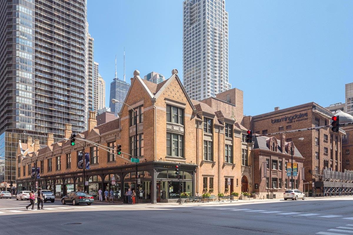
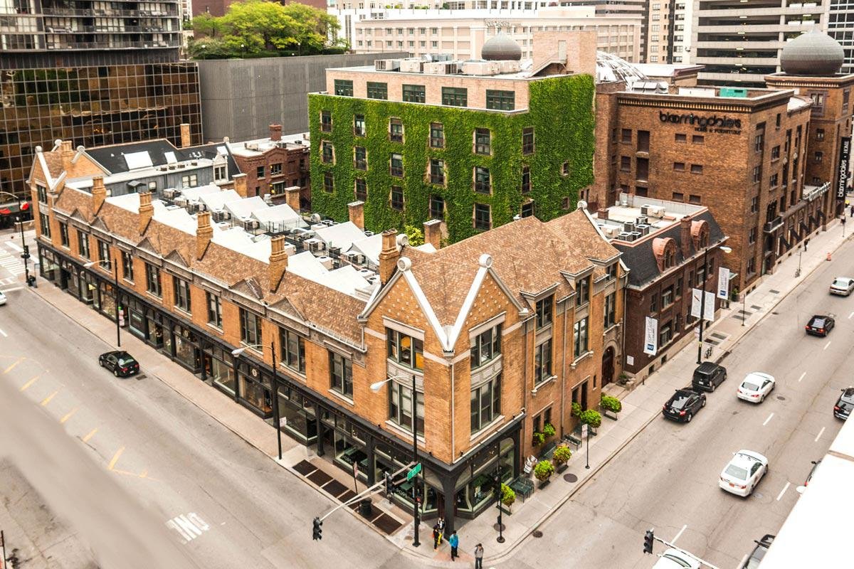
Speaking of, as you stroll down the Benjamin Franklin parkway in downtown Philly, you notice a few different buildings. The Philadelphia Art Museum looms in the distant, marking the end of the parkway. (I was planning on writing an entire review of the new Frank Gehry renovation here, but it was pretty understated and so un-Gehry-like, I am passing on that). But, there are two buildings on the parkway that feel quite comfortable in their spacious sites - the Rodin Museum and the Barnes Foundation. The Rodin Museum is pretty and well done, but, no offense, that’s not why we’re here.

Image Courtesy of Barnes Foundation via ArchDaily

The Tod Williams and Billie Tsien-designed Barnes has a striking, modern presence, configured with a heavy, large format stone-clad rectangular box nestled in the Laurie Olin-designed garden and a floating glass box above, cantilevering to create a a covered ground floor outdoor terrace. I’m not really sure why I’m describing this to you since you can just look at the picture, but it’s fun to try to place the entire exterior essence of the building in one brief introductory sentence.

And the exterior is really important. It’s a nod to what’s inside. The stone has a monumental feeling - alluding to the power of the art inside. And the Mondrian-like collage of the stone is reminiscent of the layout of the paintings on the wall - different sizes and proportions of rectangles juxtaposed together that create a quasi-grid.

Walking past the ticket booth and through the sand-blasted concrete walled entrance, you approach the building through a zen-like tree-lined path, which is separated from the building by a 10’ wide minimal depth pond.

The entrance is intimate, and it feels like you have walked into someone’s personal library. The wood-paneled interior and the 15’ plus ceiling height gives it an approachable importance. After entering, you are guided past a staircase into the Light Court. First impression is that it’s just a bit too big. Why do you need that much space? There’s a small coffee bar at the far end and a ton of lounge seating - open to all. But at second glance, there’s a feeling of being outside again. That’s why it feels big. The clerestory windows* are the sky, and the same cladding that was used on the exterior is now on the interior. It’s like the city’s outdoor living room, where they can host events and receptions year round. There’s outdoorsy expanse and openness, but it’s protected with hardscape.

*basically windows above head height, but in this case I’m talking about the light coming from the white ceiling
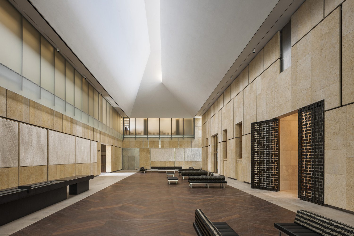
The Light Court

Image Courtesy of Barnes Foundation via ArchDaily

The permanent collection is on the opposite side of the Light Court and it’s an obvious transition. Experientially, it’s totally separate from the Light Court, and you can really feel that you are crossing a threshold. On the first go around, it feels like a French chateau was scaled down by 50%. All of the viewing rooms are connected with thick doorways, no hallways, and there is art everywhere. Honestly a bit overwhelming. But, after attending a short presentation about Dr. Barnes and his vision of the collection, everything makes more sense. Now, the second journey through the spaces is on another level (speaking figuratively, though there are physically two levels to the collection). The abstraction of details from the original building in Merion are wonderful Easter eggs to find, and the addition of the indirect lighting from above elevates the art.

Typical layout of the artwork

Image Courtesy of Barnes Foundation via ArchDaily

Within the permanent collection, you pass a light well, overlooking a small outdoor patio on the lower level. It’s a wonderful connection between the stories, and it’s such a subtle way to urge you to explore more of the building. So, guess what. I did. And the lower level does not disappoint. It’s used more for the educational portion of the foundation, along with the museum shop, and some of the support services like bathrooms, storage lockers, and an extension of the kitchen from the restaurant on the ground floor. But walking into the small outdoor gardened light well was surreal. Two lounge chairs beg you to sit. The three trees perched in the garden extend towards the sky, leading your eyes up as the light dances across the textured stone exterior. You forget where you are for a moment. You forget who you are for a moment.

At this point, you’re probably like, okay Curt, we get it…you like the museum. And you’re right, but, actually, I’ll go far as to say that I absolutely love this building. It reveals itself over and over. It acknowledges its deep history without replicating it. It celebrates a unique way of viewing art. And, in turn, it becomes art. It becomes part of the collection and a part of the city, and it’s a must see for any art and/or architecture-loving tourist or Philly local alike.

Tree Studios

Just imagine:

Walking down the streets of River North in Chicago, you feel swallowed by a sea of metal and glass skyscrapers.  Looking down the block, you see a break in the wall.  Who is offering that view of the sky?  A low-rise brick building is the answer. It’s a thing of beauty.  It’s elegant and thoughtful.  It’s a breath of fresh air in the concrete jungle.  It’s the Tree Studios on State St.

Sounds of champagne bottles popping, haunting aroma of fresh coffee, and perfectly framed scenes of window shopping greet you on the sidewalk.  The cast iron detailing of the first floor facade is reminiscent of the Louis Sullivan-designed Carson Pirie Scott building, just a few blocks down State St.  The roman brick at the second floor provides a warm contrast to the first floor ornamentation.  Above, the chimneys reach out beyond the roof line, projecting symbols of domesticity and hearth.  The lush, green courtyard behind beacons to be celebrated. It’s a well-mannered building, unassuming in its elegance and unrelenting in its charm.

Tree Studios, Image Courtesy of Friedman Properties

Following the 1893 World’s Fair, Judge Lambert and Anne Tree hoped to entice artists (particularly European ones) back to Chicago.  They lived in a mansion at 94 Cass St (what is now Wabash Ave), and they enlisted Parfitt Brothers, an architecture firm based out of Brooklyn, NY to help them build a community in their backyard.

The English Queen Anne main building, running along State St, was built in 1894.  By 1912 and 1913, the English Arts & Crafts annexes (the additional buildings to the north and south) were finished, creating a U-shaped courtyard in the back. (My understanding is that the mansion was on the east portion of the block, but has since been replaced by the Medinah Temple.) Also, the comical irony of a Chicago-based couple attempting to lure people back to their city by hiring a New York based architect to design an English style building cannot be ignored. But, so goes the classic story of wealthy people trying to show how wealthy they are and thinking everyone else cares about how much wealth they have. Anywho, all of that aside, the end result is, like I said, a thing of beauty.

Nestled in River North, which is at times an odd combination of commercial skyscrapers and surface parking lots, Tree Studios is a treat. The neighborhood is truly an urban setting - buildings are eclectic in form, function, and scale. High rises welcome office workers, condo owners, and apartment renters. Mid risers host big box stores, street level retail, and a collage of restaurants (we’re talkin’ Michelin star Spiaggia, T.G.I. Fridays, and everything in between ).

Exploring the context, you stumble across a historic single family home that is unwavering in its commitment to withstand the test of time (although, those survival stories usually involve a transition to a museum or retail). You hear the “L” rumbling past old industrial warehouses that have been chopped up into “sexy” industrial loft offices. You see a movie theatre sitting next to a boutique jeweler. A church, a university, and a luxury car dealership create a motley corner - just a few blocks from your newfound favorite building.

Tree Studios, Image Courtesy of Friedman Properties

With a story of neglected use and maintenance, the buildings of Tree Studios have been heroically restored and brought back to life (by Friedman Properties). It’s a great tale of old meets new. Sweetgreen and Framebridge, trendy companies of the 21st century, have found a home with remarkable history. But, the building is much more than its retail tenants. It continues to promote a creative community, with many studios occupied in the upper levels by painters, sculptors, designers, and more.

Just like different artists sharing studio space, distinctive buildings juxtaposed together create a world of contrast and harmony. Tree Studios is a testament to how that in-between condition can forge a thing of beauty in the city. And, it’s a reminder for all of us to keep searching for that.

Restoration Hardware

This is an essay that I wrote almost exactly 2 years ago. It’s about the Restoration Hardware here in Gold Coast, Chicago. Before the world shut down. But I think it is still relevant - maybe even more so - as we think about how the world will look after these last 2 crazy years…

Restoration Hardware: Home

Welcome to my home!  Or is it your home?  Is it our home? Do we share it? Is it a home at all?

With feelings of warmth, amiability, and comfort, Restoration Hardware feels like a place you could call home. With every room capturing a different style, you could certainly find a place just for you. It’s that idea of customization via endless possibilities that is comforting and approachable.  And a sense of courtship from the personnel makes it feel like you should be there.

But then again, nobody (that I know) has a full service coffee and cocktail bar in their house. Oh and there’s the fact that there are strangers that make it feel less familiar.  The space, being a luxury furniture showroom, has the strong capability of feeling stuffy, elite, and pretentious, but it doesn’t.  Ironically, many of those showrooms push you away, making you feel like you don’t belong.  RH is quite the opposite.

The adaptive reuse element of the building historically grounds the showroom in the notable, residential Gold Coast neighborhood.  The scale of the rooms is inviting and known.  The minimalist qualities and the muted palettes of the furniture allow the spaces to be clean and approachable.

Unfortunately, the prices are not nearly as approachable or seemingly thoughtful, and the glass chandeliers hanging throughout all 4 floors seem a bit out of touch with hints of gaudiness.  RH hesitantly explained that those sources of light are meant to provide a contrast to the rest of the space and furniture.  I am a bit skeptical of that contrasting application, but I quickly forget about those smaller problems after spending a few minutes inside.

With the allure of tangible high design and robust spaces, people come from across the city and across the globe to come to Restoration Hardware.  Harvested from my own experiences, most people are not there to shop for furniture.  Most people are either dining at the restaurant, 3 Arts Club, or “browsing” the furniture (colloquial way of saying that they are daydreaming about one day being able to afford any of this stuff).

The coffee bar always has a slight buzz to it, serving lattes and cappuccinos in the morning and slowly transitioning to wine and bubbles in the afternoon.  Drink in hand, people meander through the store, stopping to sit down on a couch, touch a blanket, or stare at some shiny fixtures.  Frequently, they will find a more than welcoming nook and plop down.  They situate themselves to get comfortable, well knowing that they will be there for awhile.

Mind you, while all of this is happening, nobody is shooting a side glance or a judging look.  While there, you don’t second guess yourself on the etiquette of getting comfortable.  There is an understanding in RH that you can do whatever you want.  (Within reason, obviously.  RH told us that they do not allow interviews to be conducted, photoshoots to happen, or any other commercial activity to occur  without advanced express written consent.)

In a romantic notion, the space’s inclusivity is a nod to its former self.  The 3 Arts Club was a safe zone for emerging female artists, and the current showroom reflects a similar openness and approachability.

Occasionally, you will see an actual “customer” sit down with an interior designer.  Together, they sift through different textile options and bedroom layouts.  Every room is a different direction of design that hopefully inspires customers and designers alike to rethink their projects.

RH claims that they still have not totally reconciled the financial implications that come from many people being in the store that have no intention of buying furniture.  But that is the risk that is found in any good architecture.  It pushes the idea of what a good business should do.  It rethinks where revenue should stand on the list of priorities.  Architecture and business need to have a dialogue of the balance between revenue and program.

So what is the primary programmatic function of Restoration Hardware?  It seems quite obvious that the end goal is to sell furniture.  Then, what is the secondary programmatic function?  Is it to create a “third place” that is such a hot topic these days?  Is it to host a restaurant in the glazed, interior courtyard?  Maybe there is no attempted secondary function at all.

Speculation is a very dangerous (albeit fun) game, so I hesitate to question what the architects were striving for.  But, I also don’t think that actually matters.  There is only so much value in investigating what the architects intended.  The real treasure is in seeing what the space has become and how it is currently used.

Good architecture also doesn’t know what it wants to be.  No, seriously.  Good architecture is when the building or the space gives the agency back to the user.  It’s an outline for a set of ideas and principles, but it is not a script.

RH lays out a framework for social connection, conversation, and exploration.  Even more, through a more pedagogical lens, it pushes the user towards a more connected, thoughtful, and open way of living.

Social connection comes through the idea of shared space.  People always feel connected to those with which they share space.  There is a subconscious, yet intimate, common experience.  The fact that these spaces are open to people beyond just the normal customer is also an important notion for social connection.  Openness and approachability are the core pillars of positive social connection. 

Conversation is found in the drinks.  Whether it is coffee or wine, drinking is mostly a conversational activity.  It is a bonding moment for people.  Sharing a drink is like breaking bread together.  Conversation is threaded from the common experience, and it is amplified when there is endless comfortable furniture to occupy.

Exploration is in all of the different design ideas.  Each room offers a new perspective on layout, finishes, color, light, and more.  Whether you are a designer or a non-designer it is important to be reminded to look around the corner and think about different possibilities.

So, is Restoration Hardware a home?

I guess it’s a shared communal home?  But, honestly, who cares.  Shed away the label.  Shake off the glorified buzzword of “third place.”  It’s a place that prioritizes social connection, and that’s what matters.